
Improving a Microinteraction for Coffee Ordering Apps
Ordering coffee from an app for pick-up or delivery is a great service for customers, and became an essential tool for businesses that couldn’t have customers in-store during Covid -19 closures.
Touchless ordering platforms have created some communication issues. For instance, adding cream to our coffee used to be something we could do ourselves when we were in store, but now apps prompt us to include instructions for the barista to do it for us. Here’s how some coffee chains have addressed this:
Problem:
Starbucks gives three choices for the amount of cream to add, but doesn't explain how much a "splash" is, so the user doesn't have a benchmark to decide how much they want.
Starbucks

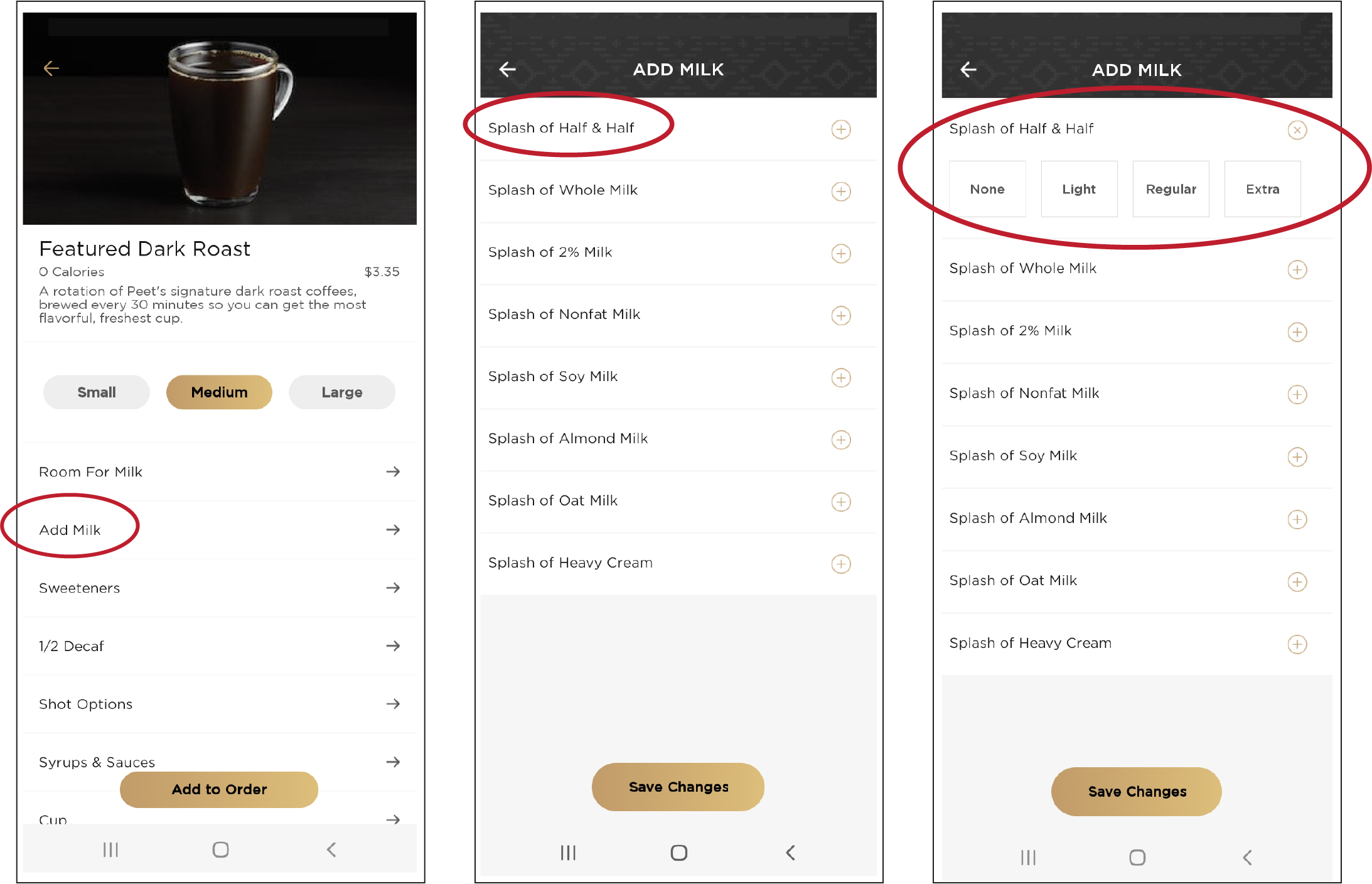
Peet’s Coffee
Peet’s uses terms that are subjective - "light" or "regular" mean different things to different people.

There’s a detailed explanation of how much cream is added based on your order, which requires the user to go to an information screen, slowing down the ordering process.
Dunkin’ Donuts
Solution:
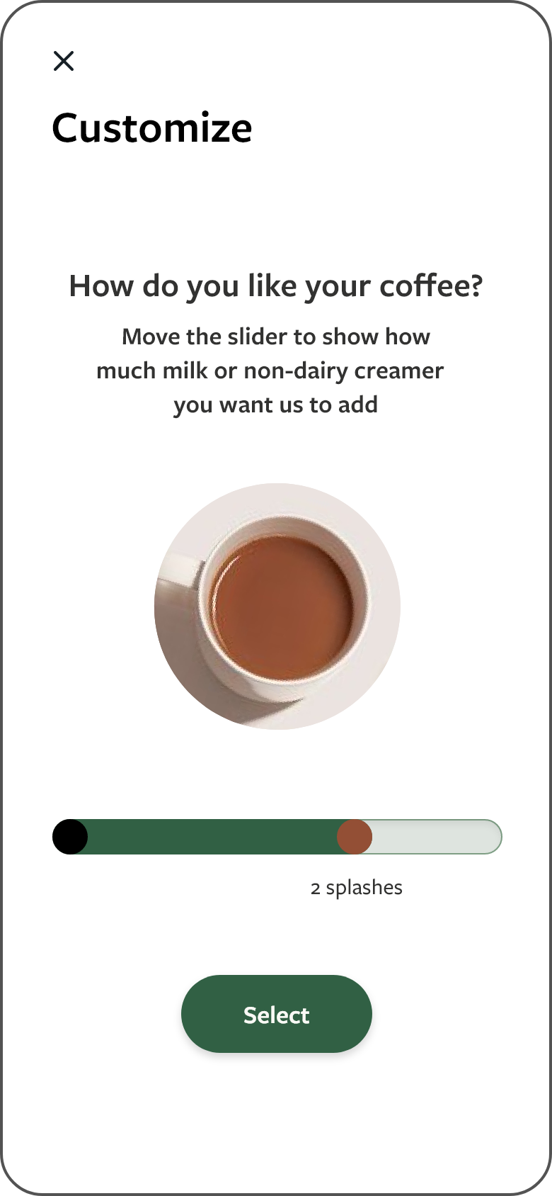
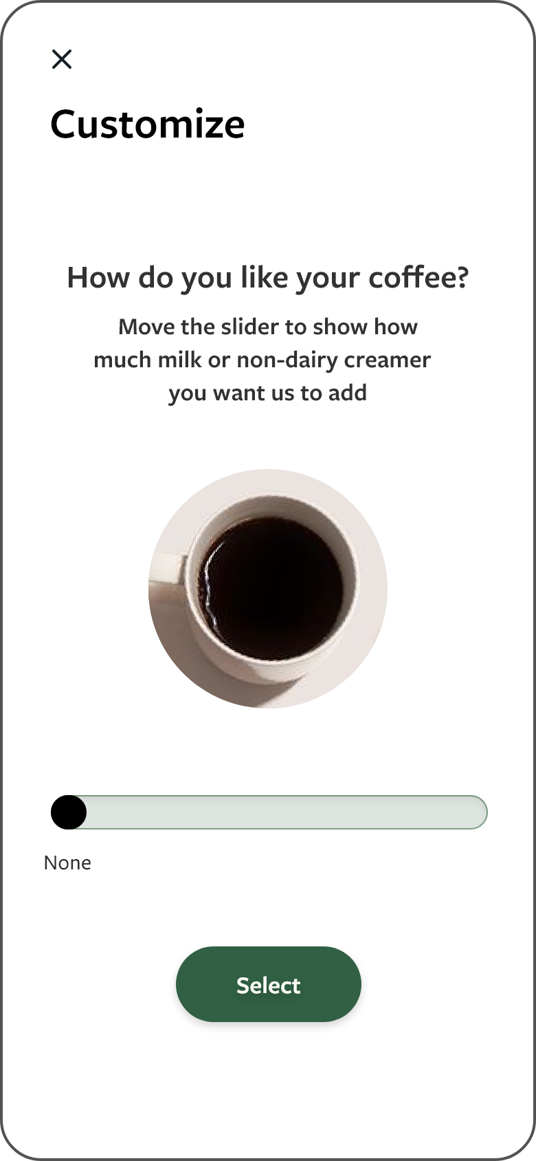
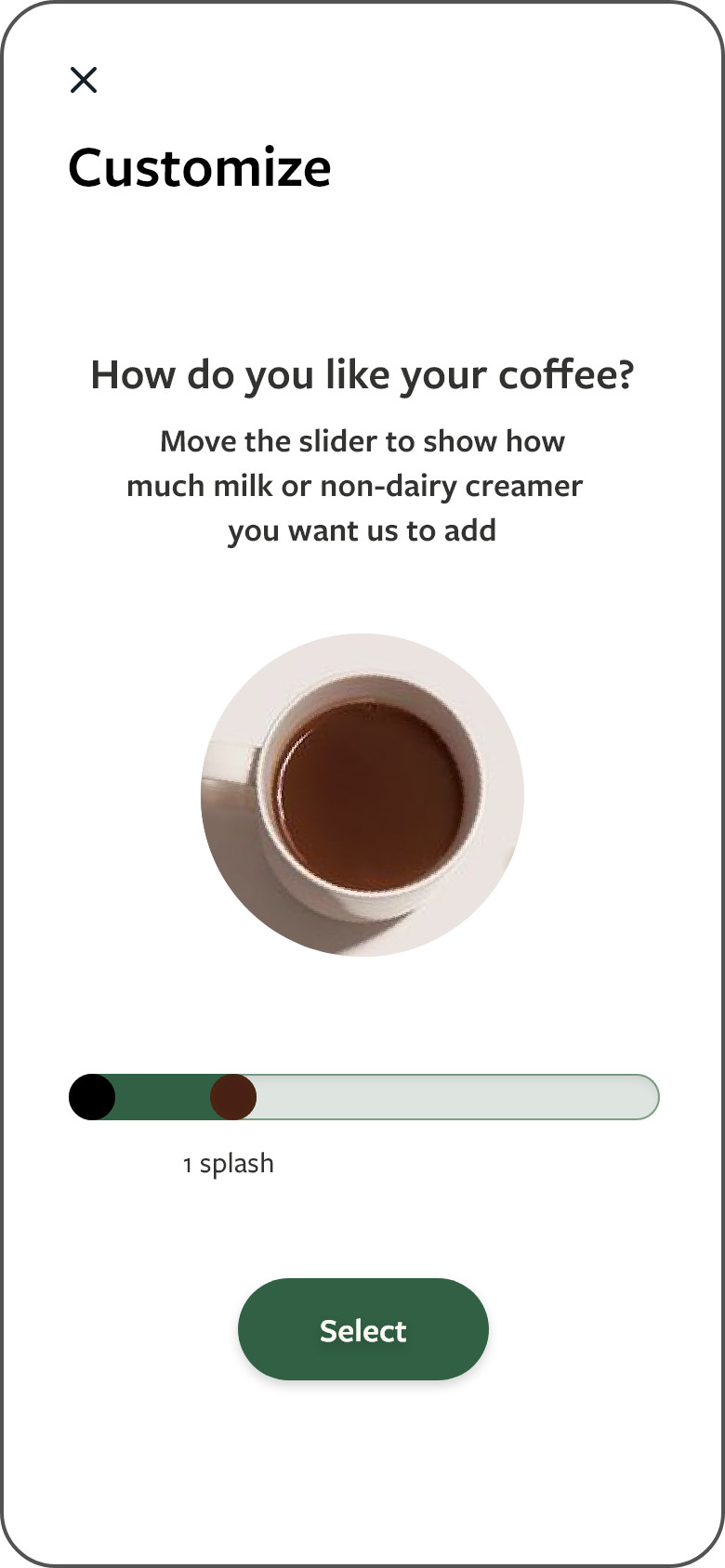
Create a microinteraction that gives the user a visual cue that corresponds to the written content.
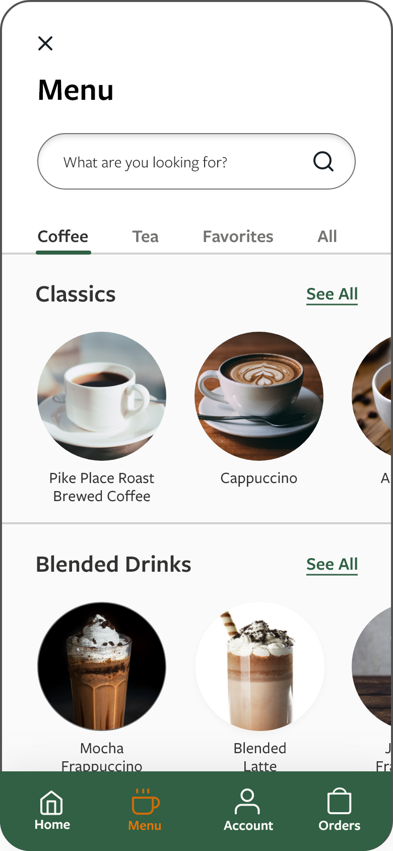
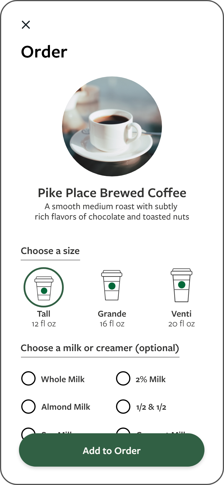
User goes from menu to order screen. After choosing a size, the user has the option to select a milk or creamer option.

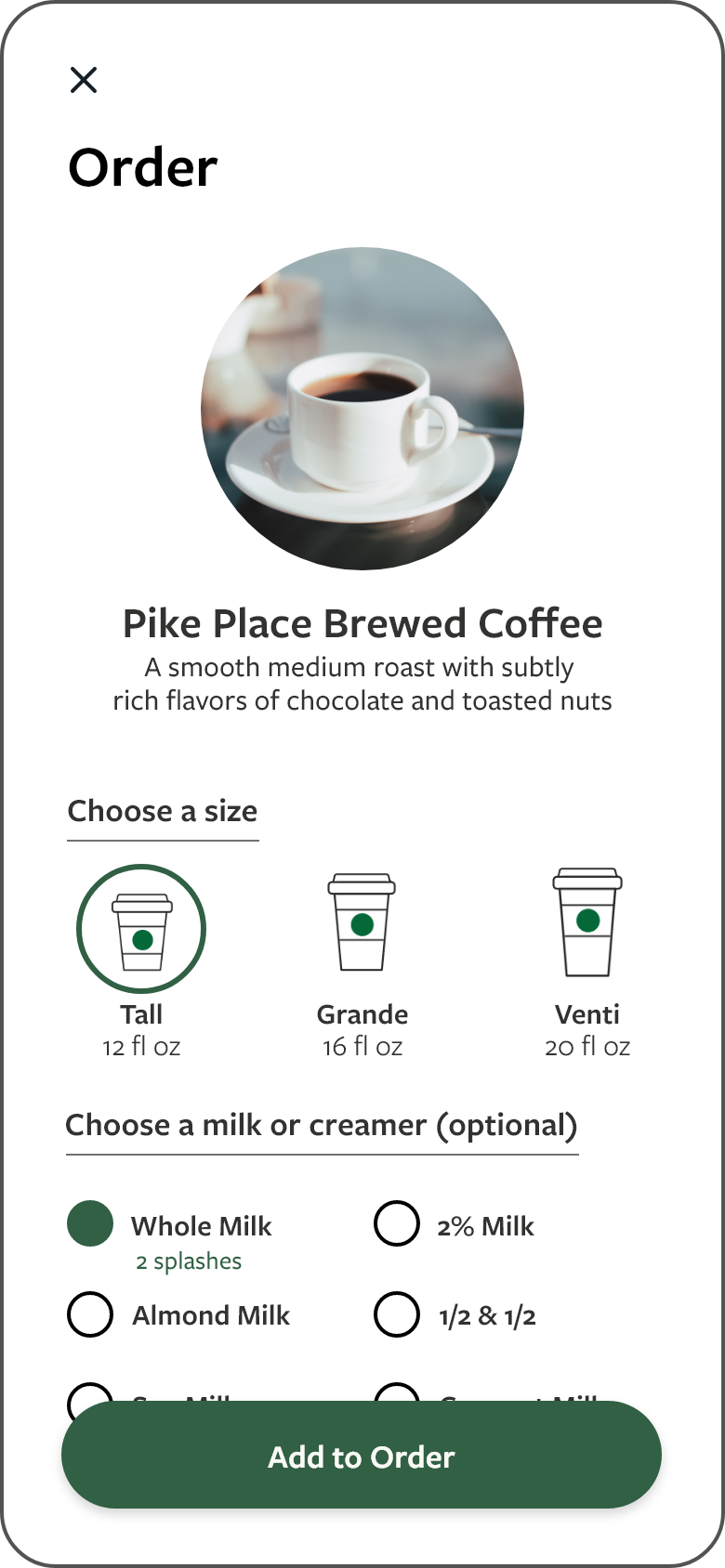
After making their selection, the user is taken back to the order screen where they can see confirmation of their choice.
Selecting a dairy or creamer takes the user to the customization screen where the user moves a slider to see how much cream their selection will add to their coffee.
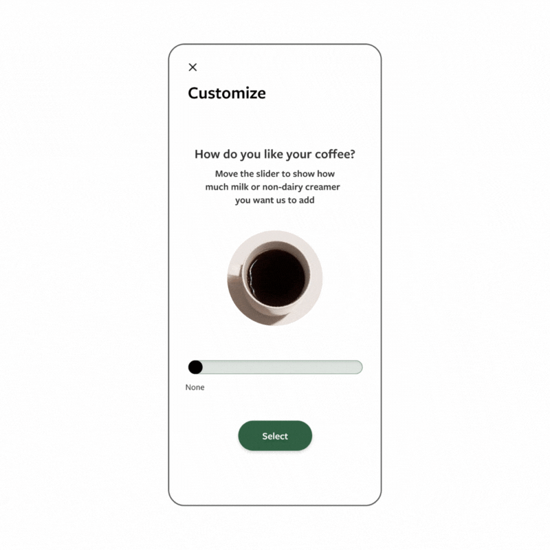
Preview of slider
Project Information:
Tools: Adobe XD, Photoshop and Illustrator
Project Timeline: 2 days
Roles: research, UI design, prototyping