How Role-Playing Can Help Consumers Better Understand Their Health Insurance
Shopping for health insurance can be overwhelming, confusing, and have significant financial consequences. I volunteer assisting individuals and families sign up for health coverage on Healthcare.gov. The majority of people I work with have never had health insurance before, and I spend a lot of time with my clients trying to explain how the coverage “works”.
Final product demo
Project Overview
Goal: create a product that teaches consumers how health insurance works
Scope: end-to-end solo project
Details
Timeline: 4 months
Design methods: generative research, storyboarding, design sprints, content creation, prototyping, user testing, 3-D fabrication
Digital tools: Illustrator, Photoshop, InDesign
Research and Discovery
The Affordable Care Act expanded healthcare access to millions of Americans, but even with improved avenues to care, many consumers experience barriers to accessing those benefits. Two independent studies in 2019 by Bend Financial and Policygenius both found that 1 in 4 respondents reported avoiding seeking medical care for fear of unexpected charges that would not be covered by their insurance. Additional research by Policygenius showed that less than a third of their survey participants could correctly identify common terms like “copay” and “deductible.” In addition to jeopardizing health, this lack of understanding about basic coverage creates waste and resentment for users.
I conducted user interviews with buyers from the Health Insurance Marketplace and those who were purchasing from an employer-sponsored plan. Common pain points cited by users:
The terminology is confusing
Lack of understanding about what costs will be covered by their plan
Fear of “surprise billing”, or costs associated with care that aren’t disclosed at the time of service
Don’t know who to ask questions to about their bills or services
Anger or frustration at paying a premium for something that they do not end up using
Frustration over “choosing blindly”, or purchasing something without understanding the features and benefits
Fear of paying too much (“wasting money”) or too little (“not getting the coverage I need”)
(Read the full interview script.)
Based on user interviews, I created a journey map to visualize the user’s end-to-end experience.

Other forms of insurance, like car or homeowners’ insurance, provide a transactional experience because users interact with a tangible product: there is a dollar value associated with the object that is insured. Our health and well-being are harder to quantify. What kind of tools could help educate users and empower them to get the most out of their access to healthcare?
Design Exploration
How could users strategize to pick the best plans for themselves? I identified four challenges to tackle during the design exploration:
a lot of medical needs can not be predicted, so there’s an element of risk that we will over- or under-purchase when choosing a plan
health insurance isn’t something a lot of people have practice using
we often use our insurance during times of stress – when we or our family members are sick or injured – and we are less likely to follow through on best practices, such as making sure a doctor is in-network, or a procedure is covered without pre-authorization
understanding your own comfort level with risk and responsibility is an integral part to figuring out which plan might be the best fit
Design Concept
The goal was to give players a better understanding of how health insurance works and some practice using it, while taking into account the elements of risk and chance that are always involved when we make decisions about future needs. I decided on a role-playing game because I was inspired by the stories of real-world adventurers like Roald Amundsen and Bessie Coleman, and thought an around-the-world expedition would offer some fun story concepts for game play. Since the game was also intended to teach the basic concepts of insurance, I decided to set the time period in the early 20th century, when treatment choices were more rudimentary. This way players could focus on how insurance works without getting bogged down by complex choices for care plans.
Although I imagined the game would be most practical in a digital format, I wanted to explore a physical game first to observe users’ experiences without them needing to first learn a new user interface. I also didn’t want to cloud this initiative with the additional burden of learning a complicated set of rules, so I used a “race game” format similar to Milton Bradley’s Life.
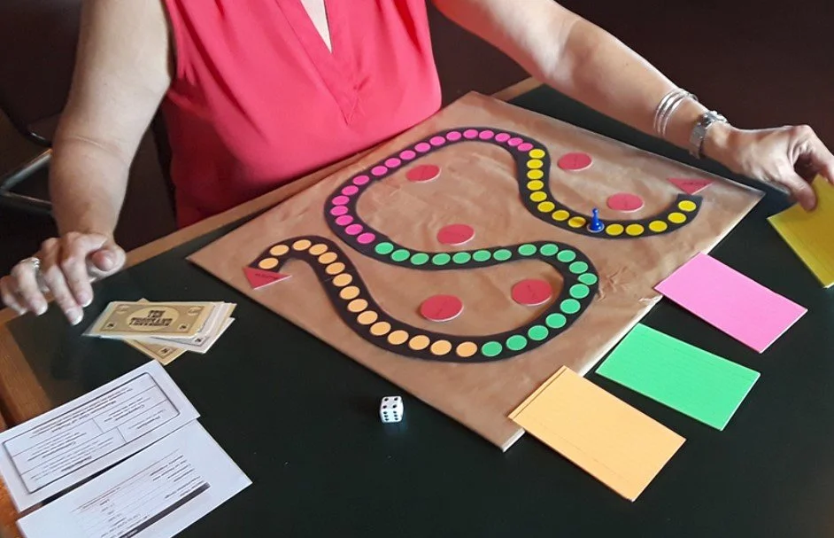
Testing an early prototype:
Players are world-class adventurers competing in a race around the globe. In preparation for the trip, each player chooses a health insurance plan and receives a stipend.
As players advance around the board, they draw game cards that describe dangerous situations: physical obstacles, wild animals, inclement weather. When a player is injured or sick, they choose a way to use their insurance to get medical care. The first player to make the trip around the world without going bankrupt wins.
Content Creation
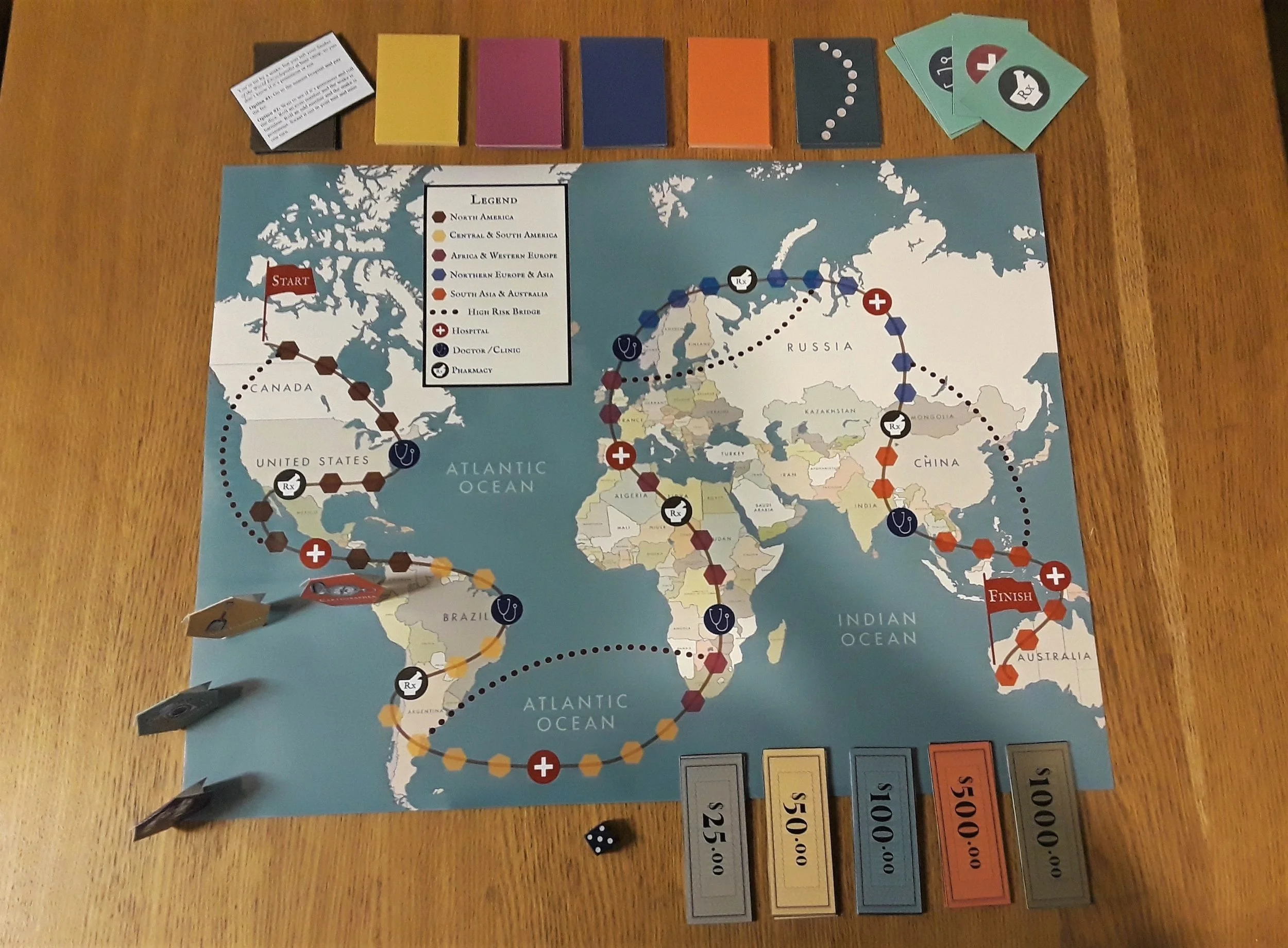
I used visual icons that evoked images of leather-bound books and tapestry bags, and a color palette of warm earthy tones and rich gem-colored hues for the game board (below) and player pieces.

“The year is 1923, and you’ve entered a wager with your fellow adventurers to see who can win a race around the world. You’ll face triumphs, danger, and thrills as you trek across seven continents.
Take turns rolling the die and moving the corresponding number of spaces to travel across the map. The legend shows the different regions of the world you’ll travel through, and shortcuts for those who are willing to take a risk.
When an ailment or injury occurs, you must figure out how to best use your insurance to meet your medical needs. The first player to make it around the world without going bankrupt wins!”
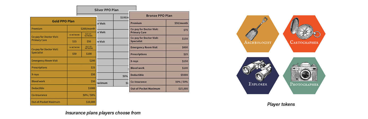
“To start, each player chooses a token to represent them, receives a cash bank and purchases a health insurance plan. The plans are based on the Bronze, Silver and Gold tiers used on Healthcare.gov’s Marketplace, with the premiums due each time a player passes into a new region on the map.”
“As players travel across the map, they draw a card of the corresponding color or icon each time they land on a new spot. These cards show an adventure or opportunity, or a credit or bill from a hospital or pharmacy. Players can choose shortcuts - the “high risk bridges” - but they must draw adventure cards from this pile, where the consequences are more dire.”

Prototyping and User Testing
Based on my designs, I built a high-fidelity prototype of the game to test with users:

I learned a lot while making this version of the game, and testing it with users brought up many great ideas and suggestions:
add credits players can gain by engaging in “healthy” or preventative behavior, such as getting a flu shot or dental check up
explore the potential to add excitement and strategy to the game if players could engage with one another on the board
the language and tone might be a barrier for users; explore ways to further simplify the language, or create a version that involved less language and had more visual cues
create versions of the game for people with different levels of experience. A beginner’s version would teach users what the different terms are and have a shorter round of play.
Users agreed that shopping for health insurance is not fun, but having a understanding of what you’re purchasing could help make it less difficult.
Next steps:
I’d like to do more user testing, and include other plan types, such as Medicaid and Medicare, EPOs and HSAs. I’d eventually like make this an online, interactive tool for HR administrators and health insurance assistors to use with employees and clients. The insurance plans in the game can be customized to match the plan details that are being offered to the user, as well as plan types, languages and even the complexity of the scenarios users encounter.